Sounds like a scam? It does. It’s not though.
This free tool is a terrific foundation for a variety of simple video formats that don’t require recording or talking and, even better, that have been trending on YouTube for a while.
Let’s explore!
Beautiful data
Honestly, I’m not sure why so many people watch these kinds of videos, but they do, that’s the important part.
I’m talking about animated data visualization or animated statistics.
I’ll give you a real-life example.
Take a look at this channel. It’s called Data Is Beautiful. And it’s full of what we call animated bar chart races. A type of video animation that visualizes a large table of data. No matter the topic, it works with basically anything.
Here’s the crazy part: Estimated by Socialblade (which gives a rather broad range of estimates, just to be clear) the channel Data Is Beautiful is cashing in between $5K and $80K a year on YouTube.
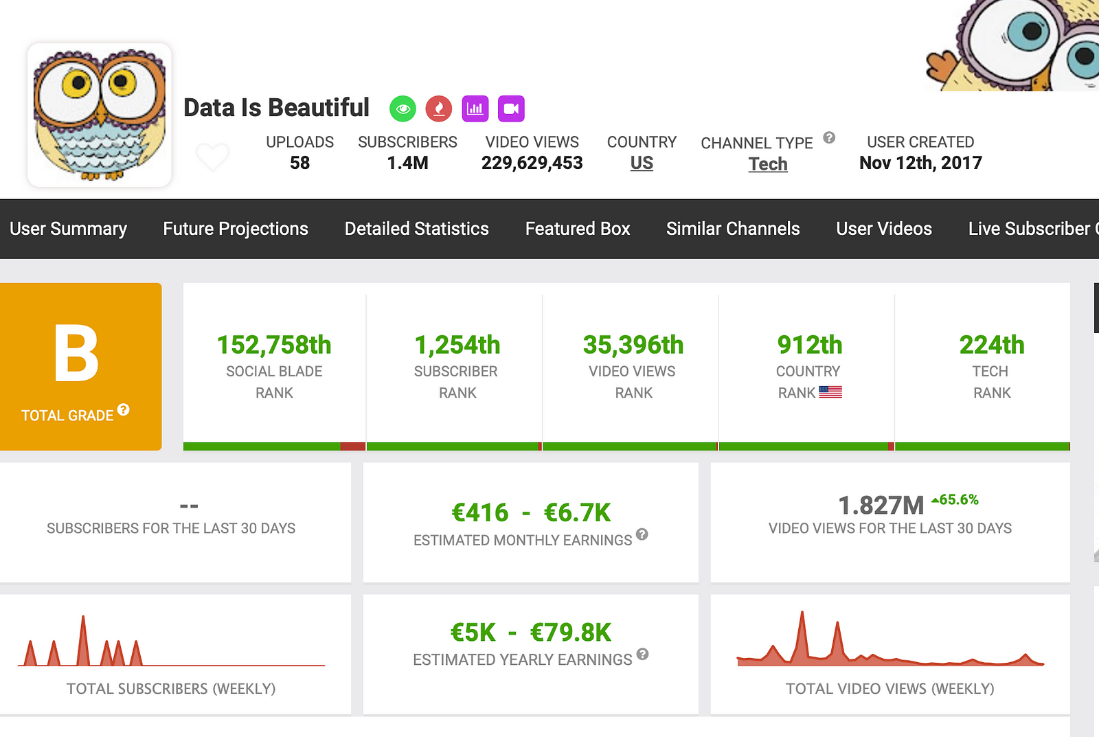
In my experience (and judged by SocialBlade’s estimations on my YouTube channels) the real number lies somewhere in the middle to the upper half of the range.
Let’s imagine this is the case. This means this channel easily earns 30-40K a year with animated data videos.
It gets even better though. This channel was opened in 2017 and has only uploaded a total of 58 videos. So, the channel is making 40K a year for 58 videos in 5 years.
The tool
Now, let’s talk about the free tool to use for these types of videos.
The site is called flourish.studio.
On this site, you can select a variety of visualization formats and options. From maps to charts to animated graphs.
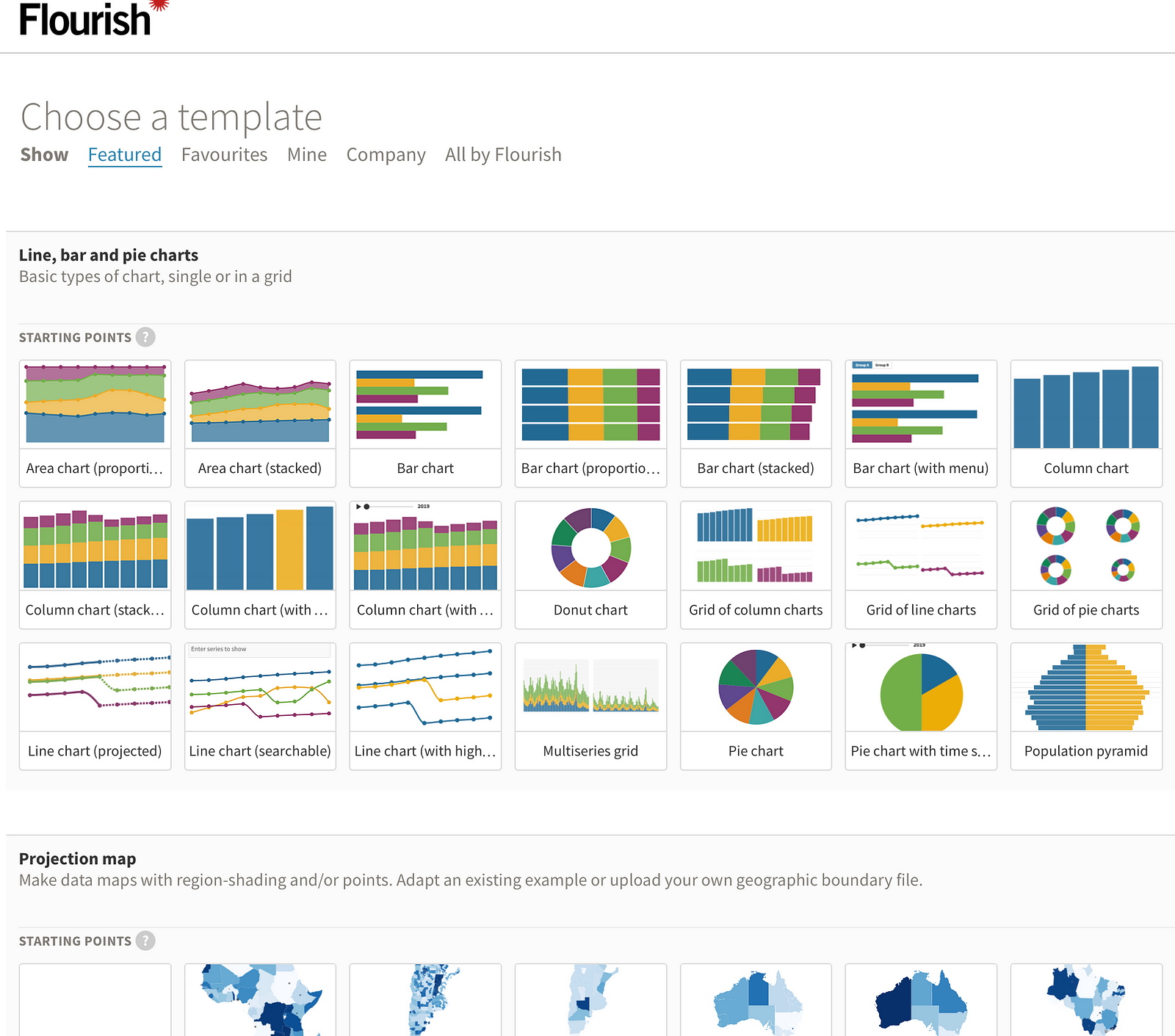
The type we’re looking for here is called bar chart race.
Bar Chart Race
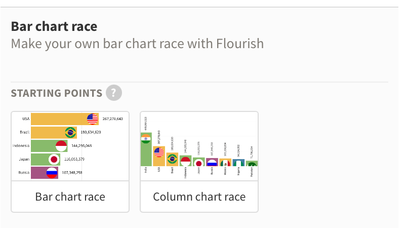
This format gives you a nicely animated bar chart on any topic you like. You just need to put in the data points.
Where do you get data, you might ask?
That’s the tricky part. There are a couple of options:
- You could create the data yourself. Say, you wanted to make a bar chart race about the development of Covid from the beginning to now all over the world — great idea actually, don’t steal that 🙂 — you could look up all numbers from the WHO pages and put them in manually. That would take a lot of time.
- You could look for ready-to-use spreadsheets of data. There are many websites that give data on various topics in form of .csv files which you can then directly upload to Flourish and use in the bar chart race.
I’ve done both. On smaller topics, I gathered the data myself. For example, I created a video about human evolution from early apes to humans. For this, I gathered the data points myself and put them in by hand. In this case, it’s another format called line chart race, but the idea is the same.
/media/b7a9c5af66286ed7f936487c2a33cc41
I’ve also used pre-filled spreadsheets for other projects, like data on crime rates or population growth. Google those and you’ll find many data sources.
The bottom line
People keep asking me what a faceless YouTube channel is, and how and what they can create to build a channel.
Flourish is a fantastic and free tool for many types of videos. All of which don’t require recording, speaking, or much editing. It has a slight learning curve to it, but once you get the hang of it, you realize how much you can do with Flourish. And as you can see from the channel Data is Beautiful, there’s also a lot of money to be made.
This is only one way to make YouTube videos and build a faceless channel without really “making” videos. In another post, I highlighted 4 more ways to do it.
The moral of the story is, you don’t have to be a “traditional” vlogger to be successful on YouTube. A job that requires hours and hours of work in front of and behind the camera, as well as skills in video editing.
On the contrary, some of the most successful channels ever on YouTube are in fact faceless channels. You’d be surprised.


