
Medium is constantly changing. This isn’t new. It’s been that way since the beginning.
At the moment, Medium is rolling out a completely redesigned website. It’s got some advantages. It also removes a beloved feature.
Let’s compare the new to the old design, shall we?
Side-by-side (and how you can try the new design)
Many of you might not have seen the new design just yet. It isn’t rolled out to everybody. Some writers are already using it, though. I remember Susie Kearley writing about this design update.
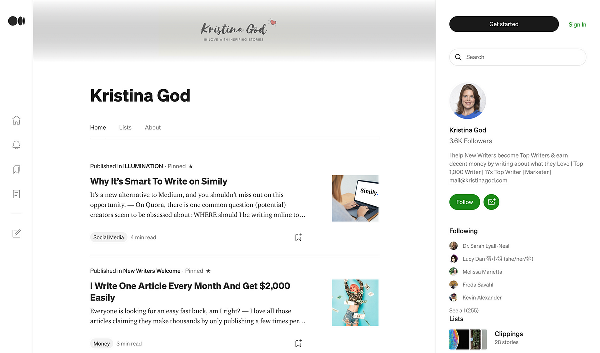
In case you haven’t seen any of it, here’s a comparison of the two layouts. Huge shoutout to my girl, Kristina God. I’m using her profile as an example here.
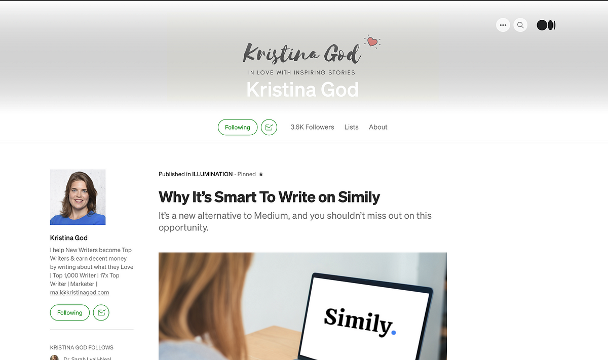
As you can see, these two designs look fairly different. The overall feel is similar, staying mostly white and minimal with few icons and buttons. The layout has changed a lot, though.
Whereas the old layout came with a sidebar on the left, a header and the main text body below the header with an endless (loading) stream of the writer’s posts, the new design offers a three-column layout.
On the left it starts with a menu sidebar that houses the navigation buttons for home, lists, stories, account, etc., the middle features the posts, and the right handles the bio section as well as more info like lists, followers, and (within story view) a list of related posts. See here:

How you can view the new design
You might be asking how you can check out the design live.
I don’t have the new design enabled on my Medium account. But I found a way to use it.
What I did to view it, is navigate to a Medium page inside a private new tab in my browser. That usually works because it doesn’t use your saved cookies and browser cache.
Upsides and downsides
Design is always somewhat subjective and personal. Some will like this new design, some won’t.
I like it.
With it, there come upsides and downsides. I see the following:
Upsides
- The new design has a better structure with the three columns, it removes unnecessary and unused white space and streamlines the experience across the different pages (profile, story view, etc.).
- The main post column is easier to navigate, for example, many writers have multiple pinned posts at the top of their profile. With the old design, it took ages to scroll past those pinned posts and see the new ones. It’s quicker with the new design because the previews are shorter/smaller.
- The related post section could be a fantastic new way to connect readers with new writers IF these related posts are actually relevant and handled well by Medium. We’ll see about that.
Downsides
- Related posts again. As Kristina God and a few other writers mentioned about the new design, this related post widget on the right side could be a distraction for the reader. We don’t want that.
With the old design, there was just the text body to look at, pretty much. Now, there’s more that distracts the reader.
(A side note: This could be a positive as well because it might keep the reader longer on your story page and therefore increase the member reading time. In that case, awesome!) - Some features have gone or will go in the future. For example, Kristina God just wrote a post about the missing image size adjustment within the Medium editor. That’s one feature that had to go in favor of the new design. Because with this three-column layout, all images need to have the same size.
- Ads. I’m torn on this, but let’s imagine Medium has another plan with this new related post section on the right side. It could be a space to show ads. Now, I don’t think this will be the case, necessarily. But you never know.
Then again, I don’t even know if that was a bad thing. Ads could be a positive if Medium lets us earn money for external views through these ads. AND if ads are ONLY shown to free users, not to paying members.
The bottom line
The new design will be awesome for some and less than ideal for others.
Again, so far I like it. But that heavily depends on how Medium will make use of the right column in particular. This one could go both ways, very well or extremely wrong.
What do you think?